The Client:
HH Point Of Sale (HH POS) are a multinational manufacturing company with bases in both the UK and China, who specialise in producing standard and customised point of sale solutions for the beverage sector.
An industry leader, HH POS works with world-renowned brands like Kopperberg, Greene King, Budweiser, Bud Light, Strongbow, Molson Coors, and more, designing and producing solutions such as beer fonts, beer towers, tap handles, and digital displays to maximise sales and boost brand impact in hospitality venues worldwide.
HH POS approached us as they needed an online presence so that they could attract a wider range of customers – this would involve us building a high-quality website for them from scratch.
HH POS wanted the website to be crisp, clean, and uncluttered, while ensuring that all the necessary details of their business and product range were included. In particular, our brief was to use the website to showcase their products on individual pages, while ensuring there was ample space and functionality to add many more products to the website in the coming years, as HH POS continued to design and develop innovations for the beverage industry over time.
The Process:
So that we could begin building the website with a strong idea of what kind of style HH POS were looking for, we asked them to send us three examples of existing websites that they liked the look and feel of, along with the reasons they liked those sites specifically.
We then looked through the example websites HH POS sent us, took note of the things they liked, and worked out how to incorporate those aspects into the new site that we would build for them.
When starting work on the website itself, we designed it as a ‘test site’ on our own private server. We do this with all our websites under construction, as it allows us to build the site in a place where the general public can’t find it, but where the client can see and review our work via the direct links to the project that we provide.
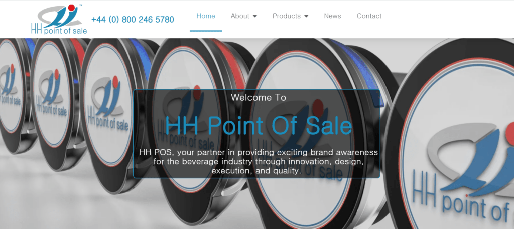
We began by creating the homepage of the site, making sure to feature HH POS’ brand colours of blue, red, and white prominently throughout the design, while also ensuring we stuck to the brief of a modern website that is easy to navigate and includes all the required details.
Next, we made pages about the HH POS team, their services, company history, and contact details. We also created a blog for the website, before adding the pages that showcased HH POS’ product range in all its glory!
Once all these pages were designed, we then created the text content for the website.
Doing this ourselves was helpful in terms of delivering the website within a short timescale, as we were in control of getting the content written, instead of relying on someone else to do it and then send it through to us when complete.
By this point, the desktop version of the website was practically finished! But there was still much work to be done, as these days over 60% of global website traffic comes via mobile devices.
For this reason, we always redesign our websites for mobile and tablet to ensure they’re fully compatible across all devices, with all functionality working as intended.
Once this was done, it was time to add the finishing touches to the website and conduct a comprehensive series of checks before the site went live.
As part of this, we put the whole site through a comprehensive proofreading process to ensure no spelling mistakes or grammatical errors would be present. We first did the proofreading ourselves, and then asked HH POS to have a final look too – the more eyes the better!
Finally, we ensured the website was protected by an SSL certificate, before adding a Privacy Policy and cookies banner.
With all this done, it was time to take the site live for all the world to see!
The Results:
HH POS were delighted with the finished website, saying that:
‘We are absolutely thrilled with the website that R50 Marketing has designed for us! From the initial concept discussions to the final launch, their team demonstrated unparalleled creativity, professionalism, and attention to detail.
‘The website they created perfectly captures our brand identity and showcases our products and services in an engaging and visually appealing way. Not only is the design modern and sleek, but it’s also incredibly user-friendly, making it easy for our customers to navigate and find the information they need.’
To further develop the site, we plan to add ecommerce functionality so that HH POS can sell their products to their customers directly. This will synchronise nicely with our ongoing marketing campaign for HH POS, which has generated a large and engaged audience for them over the past few years.
Adding an ecommerce store to the website is a complex process that needs to be done correctly. For instance, the buying process will need to be as smooth and frictionless for customers as possible, while still collecting all the necessary order information that HH POS require – such as the specific products that are being purchased, in which variety, what quantity, and where they need to be delivered to.
Creating the ecommerce shopfront will be an exciting task for us and another step in the right direction for HH POS!
What HH POS Say:
‘R50 Marketing took the time to understand our unique business needs and goals, and they delivered a website that not only meets but exceeds our expectations. Their expertise in website design and digital marketing truly shines through in every aspect of the site.
‘We’ve received numerous compliments from both customers and colleagues about the new website, and we couldn’t be happier with the results. It’s not just a website – it’s a powerful tool that helps us connect with our audience and drive business growth.’

